For those of us who are the beneficiaries of Uber, the car sharing service, during the last week we were introduced to an updated app. In some cases, people were offered advanced notice. In my case, “None.”
Requiring an Uber driver on Wednesday night, I searched my iPhone screen for the familiar app.

It was nowhere to be found. I went to settings and it was not there. Then, I searched my screen finding an unrecognizable app. There was a curious circle that looked like the letter “C” facing backwards. I tried to open. No luck.

So, I called a friend who still had the old app; he summoned a car for me. Gave my phone to the arriving Uber driver requesting assistance. He said that I needed to shut my phone down and reopen it. Then, he said that the new app would be functional. I tried that and it worked. Shortly after that, I received an email from a friend in Greece with a link to a Wired magazine article by Jessi Hempel providing some details:
Here’s the thing, though Kalanick (Uber CEO) is not a designer. He’s an engineer by training and an entrepreneur by nature. Yet he refused to entrust the rebranding to anyone else. This was an unusual decision. Most CEOs hire experts—branding agencies that specialize in translating corporate values into fonts and colors—or tap an in-house team. Not Kalanick. For the past three years, he’s worked alongside Uber design director Shalin Amin and a dozen or so others, hammering out ideas from a stuffy space they call the War Room. Along the way, he studied up on concepts ranging from kerning to color palettes. “I didn’t know any of this stuff,” says Kalanick. “I just knew it was important, and so I wanted it to be good.”
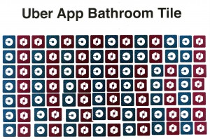
Catherine Ray (an Uber executive quoted in the article ) got the idea for Uber’s new app from the patterns of tiles in her bathroom floor.

Unfortunately, the new Uber app does not make the grade as a bathroom floor tile — nor as an app. When discussing this with an Uber driver on a recent trip, he said, “That guy has a monumental ego.”
There are basic steps involved in creating a logo, or in this case a new app design. The client defines the issue and the designer creates the design. It appears that the Uber team, including Travis Kalanick’s colleagues, committed the sin of attempting to be both clients and designers. Under such conditions, failure is a guaranteed result. The new Uber app is a disaster in the realm of corporate communications.
There is a long history of brilliant graphic designers having created a visual language that works for corporate clients. I mention a few:
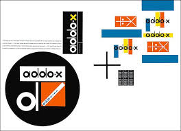
Ladislav Sutnar / Sweets building materials catalogues
Consummated in the 1950s, Sweets building materials catalogues were one of the first American corporate identity programs. In this sense Sutnar was a pioneer in what has become known as informational graphics.
Top: Sweets logo. Center: Golden Griffin bookstore. Bottom: addo-x adding machine promotional literature.
Massimo Vignelli / New York City Transit System
For anyone who has ever used the New York City subway system, the clearly legible symbols and signs differentiated in color, provide comfortable guidance through its maze of stairways, platforms and subway cars. Graphic standards were provided so that graphic designers could absent themselves while MTA staff executed necessary signage. This signage is in the collection of the Museum of Modern Art.

Chermayeff and Geismar
This firm has created myriad logos that we encounter on a daily basis.

So, one must ask why Uber missed the mark so completely? The Wired article indicates corporate hubris, suggesting that highly successful entrepreneurs consider themselves to be omniscient with skills that can be applied in any area. One might ask if Uber’s corporate hierarchy could have spent their time more productively in other ways — like tending to business. The bad logo replacement has already had some fall-out: on Monday, Andrew Crow, Uber’s head of design, resigned. Despite a (chimeric) $62.5 billion valuation, Uber is not a profitable company. Investors should ask if the Uber bottom line will suffer even further as a consequence of this epic design fail.


