A bit of history
When I arrived in Montreal in the early 70s the city had just inaugurated its subway creating the need to reorganize its public transportation system around connections between the existing bus network and the new subway one.
The reorganization touched on the location of bus lines and stops to coordinate with location of subway stations, the color scheme of sign posts from traditional yellow and black to blue and white, a new tele-communication system to inform passengers of next bus passing time given the city wide cellularization of telephony, the installation of shelters and seats at bus stops, and the installation of an illuminated advertisement panel at bus stop shelters to help pay for all of that!
A short saga of sorts I would like to discuss in terms of the design vagaries of the bus stop equipment and on the encounter point experiences they provided, since any such discussion cannot skirt its economic, social, technological and instrumental contexts.
As proof, if proof is necessary, is the number of images placed on Google Image by observers of those vagaries that made my job of documentation simpler.
My own image contribution here, for a change, is limited to the feature image, the image that introduces the section on the current “high tech” version of the bus shelter, and the last image.
[alert type=alert-white ]Please consider making a tax-deductible donation now so we can keep publishing strong creative voices.[/alert]
In the beginning…
The bus stop is not a bus station implying a terminus function … along its numbered service lines the bus stops are located at predetermined points where a sign post provides the minimal identification of these bus lines numbers.
Before the cell phone era , there was only the line number(s) on the sign. After the cell phone became current two numbers were added: the identifying number of the stop and the number to dial to find out about the time of the next bus passage … this involved changing the sign shape to rectangular in order to accommodate all that information.
The original shape of the sign panel was round and its colors were a very visible combination of yellow and black. The need to integrate the color scheme of the subway and the bus lines signs made the municipality opt for the blue and white combination, first in use for the subway stations outdoor signs.
As can be seen in the image below the sign post has a key role in the technical and social dynamics of the bus stop since it indicates where the head of the waiting line is, and where the bus driver should stop to align the bus entry door with the head of the line.
As can be appreciated from this image, the sidewalk is too narrow to accommodate a bus shelter plus the sidewalk.

An original sign-posted bus stop
Bench seat and garbage can upgrade…
In spite of winter weather considerations, bus stops were provided with one or more public benches and a public garbage can. At the onset of the first snow the benches were removed and re installed at the end of winter…check the way this bench is simply bolted to the concrete base.
Note that the sign post, bench and garbage can are located at some distance from the sidewalk to allow clearance for sidewalk cleaning and snow clearing equipment.

An equiped original bus stop
The first bus stop shelter…
Pressure from an aging population for protection from wind and rain caused the municipality to install sign bearing, glass enclosed shelters that included a weather protected bench separately from the outdoor bench.
The indoor bench is a divided two seater to discourage overnight use by the homeless.
The original shelter design under strong wind condition
Unfortunately the wind force above a certain limit caused the unfortunate uprooting of the shelters and the eventual replacement of the frail and light shelter with heavier concrete based ones.
The improved original shelter design with concrete base
Note the front to back slope of the roof which keeps icycles away from the entrance to the shelter. What is not clearly shown are the openings in the bottom of the concrete skirt for drainage … also fixing the sign to the roof edge makes for the economy of a separate sign post installation.
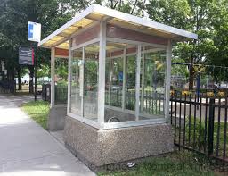
The bus stop shelter “Design” version…
As Montreal sought to confirm its status as “Design City”, bus shelters were the chosen urban equipment to be re-designed, adding a lit advertisement panel, for revenue and for distant visibility of the shelter, with a steel four posts frame, a red color ring beam at the roof base and a red highlighted plastic vault roof for visual distinction.
The red ring beam will sometimes be colored blue to distinguish one municipality from another on the island of Montreal.

The “design” version of bus shelter
The garbage can and the sign post identification were usually not incorporated in the shelter that remained a pristine steel and glass structure, heavy enough to resist wind uplifting forces but not assembled to resist lateral force, or shock, where no reinforced advertisement panel section was installed at one end of the shelter. (See image below).
Note the graphic logo of the newly constituted pan-Island Montreal Transport Society pasted on the end of the vaulted roof.

watch them lateral forces !
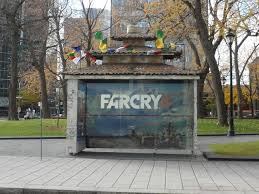
While some artists took to posting works of art “free for the take” on the shelter back glass wall, as advertisement for their work, some shelters were squated after hours by homeless people who could only sit on the interior twin place divided bench.
Artists and homeless people were not the only ones to appropriate the bus shelter whose vaulted roof was irresistible as an advertisement prop for coffee machine brands. (See image below)

nespresso bus shelter roof
The current high-tech version…
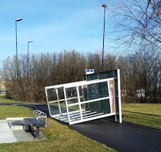
Given the rusting of its steel frame and the sorry state of its plastic roof elements exposed to weather, the “design” vaulted version has given way to the current version of the bus stop shelter which used the advertisement panel as the dominant visual role for distant visibility and structural role for solidity.
The glass walls edges are encased in an aluminum frame which protects their bottom and corners from vandals and sidewalk cleaning machinery.
The roof is a simple plane extending over the lower end of the aluminum frame, which is attached to the ground via short adjustable legs made of weather proofed material. (See image below)
Most important, perhaps, is the fact that this version is being sponsored by a well connected local communication giant corporation.

The newest bus shelter privately sponsored by a local communication giant
The garbage can, sign post and information panel are still part of the “kit”, while a tourist oriented experimental lit panel, indicating the times of passage of the various bus lines , has been added to a heftier electrified sign post. (see the image below)

the change from posted written dayly schedule of bus passage times to electronic display of next three passage times similar to subway system.
Although it lacks the visual bezaz of the vault roofed previous design, the current version has gained in an image of efficient communication and design sobriety.
In the larger context of “occupy” movements and artistic interventions in the city, the new bus stop shelters have been the target and object of artistic expressions aiming at raising environmental and cultural awareness.
bus shelter roof treatment in Chinatown
As the saga unfolded and unfolds …

The good old bus stop sign of a small Ontario town … waiting for a taker in a Quebec flea market!
Way back then, probably with a single bus line and most likely movable sign posts, the indication BUS STOP would tell you where the bus stopped on its route, and the nearest passerby would tell you when the next bus would be passing … if you were from out of town!
It is interesting to note that, today, all versions of the bus stop discussed here are still in use, sometimes along the same road, while the installation of the latest version slowly spreads from the most popular routes to the far ends of town ones.
As a footnote I have recently noted how the “design” version ones, still in use, have had their spindly legs reinforced where they join the ring beam at the base of the vaulted roof.
Finally , a recent collision of car with the newest shelter model, having badly hurt the daughter of a municipal elected official, has shaken the population and caused a media carried movement to reinstate the old concrete base shelter model, or a newer version adapted to the current design.
The story of the Montreal bus stop physical treatment we have sketched in this post is tied to the city growth and the social economical pattern of the growth distribution, influencing who you would meet on certain lines … true to this day … and what and how many languages would be spoken on the bus, etc. …
Once upon a time you arrived at the bus stop and waited for the bus to arrive sooner or later as in the feature image and the one above.
Today you arrive three minutes before the bus is scheduled to arrive because you know, or are able to find out ahead of time, when the next bus will arrive within three minutes plus or minus the scheduled time.
The onus is now on the rider and the driver to be on time, within that tolerance!
I have yet to see a sign post vandalized … I see plenty of bus stop shelters with glass walls graffitied or smashed!
You may wish to draw your own conclusion as to the changes in encounter point experiences as the bus stop evolved.
Credit Maurice Amiel for the feature image, the image of most recent shelter model, and the last image.
Credit “Google Image” under “Montreal bus stops and shelters” for all other photographs.